
9th Oct
Soggy Saturday run up the Water of Leith. Mary is very good for getting us both out the door on inclement days. I'd be more inclined to stay home and hang myself, when the weather is grey and gloomy.

There was little of note on the WoL apart from these four lady goosanders around Stockbridge. I'd forgotten to bring BBB (birdy-bread-bribes) so could not lure them closer for a photo. There was also a dipper near Pizza Express (not taramasalata) but it was near dark as night and the photos are hardly worth posting.
One other thing of note was a cctv camera posted to capture passing traffic at the Dean Village where signs from the council (saying not to proceed due to landslip) have been roundly ignored for a few years now. There is a well worn path round the half-hearted old barriers and slightly more convincing (but not-unpassable) new barriers, where dog walkers and joggers have meandered past the obstacles. I have no idea what the monitoring devices hope to achieve but I gave them a little wave and took a photo and haven't as yet been contacted by the council. If I'd had a business card I'd have held it up to the camera.


tasty dipper
stockeroo gormers

say cheese

modern art gormless
We were about 3.5 miles into the run and I asked M how long she would like to run for? We had set out saying "about 6miles" and so were more than halfway through the potential minimum. I was not very upbeat but welcomed a wander round the Scottish Gallery of Modern Art grounds. There are a few big name sculptures and we rarely give them a proper look-see as we make our way into the gallery indoors. Today we were a bit damp and not inclined to drip round the gallery in sweaty kit. But we did scrutinise the outdoor stuff. It was pretty poor. The Gallery obvs has a budget that allows it to buy big name sculpture but sadly not enough of a budget to buy good big name sculpture.

the best thing in the gallery grounds

😭😭😭

second best art in the grounds

I haven't been to the much advertised Harryhausen exhibition yet.

B Hepworth
This is a Hepworth, and while better than that one recently panned in the Botanics, it is not very fine. In fact I don't know how she could have been bothered as it must have seemed lumpen and crude to a craftsperson of her skill and judgement, long before it was finished. To me it looks like some packing cases on the ground between filing cabinets. Kinda shite.

H Moore
Archetypal Moore. I find it hard to see any of Moore's work. They are so iconic that they almost all just look like Moore's and I stop looking. I suppose that's what makes him famous. Same as Picasso; you just see some painted lady looking in 2 directions at the same time, and it's a Picasso. In an effort to see beyond the standard Moore I tried to look closer. There were bits I liked and bits I did not. I have been trying to remember an unflattering quote. Someone said he had crapped outside every famous building in Europe. Or words to that effect. Currently Andy Scott is beginning to approach that ubiquity.

bit I didn't like
What the hell is going on with the "face". If that isn't intended as two eyes and a dopey grin then he shouldn't have put those marks anywhere near the head / face. Once seen, you can't un-see it. It just looks dimwitted. Get the filler out Henry, and sort that bit please.
However I quite like the subtle lines on the "legs". (Pic below) I don't know whether they are the result of construction techniques (I doubt it, since I presume this was made of clay and cast in bronze) or deliberate texturing. But they remind me of the lines on Airfix aeroplane kits I made as a child - delineating wing structure etc - and enhance the form of the curves. Even though they don't recall any parts I've seen on real ladies.
I also like how close the hip and hand come - a small gap between the 2 which seems to me like a subtle joke or a tune whose melody is about to do one thing but then goes a different way or employs a surprising harmony. You can probably tell I'm not a huge fan, but I don't hate his work like I do Picasso's. If you are wondering who I'd rate by comparison (in the same field of figurative bronze sculpture) I'd say Marino Marini or Giacometti are much better. When I see a marvelous Giacometti I am definitely stirred and fired up - it makes me want to get out clay or welding gear and make stuff. I am jealous and in awe at the same time. Moore on the other hand; more like a pile of sausages.
I also like how close the hip and hand come - a small gap between the 2 which seems to me like a subtle joke or a tune whose melody is about to do one thing but then goes a different way or employs a surprising harmony. You can probably tell I'm not a huge fan, but I don't hate his work like I do Picasso's. If you are wondering who I'd rate by comparison (in the same field of figurative bronze sculpture) I'd say Marino Marini or Giacometti are much better. When I see a marvelous Giacometti I am definitely stirred and fired up - it makes me want to get out clay or welding gear and make stuff. I am jealous and in awe at the same time. Moore on the other hand; more like a pile of sausages.


I like this bit


I was disappointed to see this by Rachel Whiteread. She is a sculptor I regard highly, although her work doesn't thrill me like Giacometti. It is not swoopy forms and clever curves. More like blocky spaces and solid casts. These 2 hollow hulks of metal are about as light on their feet as a couple of fly-tipped chest freezers. There was a plaque nearby trying to get the audience to interact but other than lying on top of these white-goods sarcophagi, (not allowed: "do not touch" even though they are sturdy metal), my only interaction was to walk away rolling my eyes.
I think my admiration for RW comes from the fact that she does not wear makeup and makes large serious pieces. I saw her shoeboxes (Embankment) in the Turbine Hall and it was a disappointing FAIL. Falling at the first hurdle. Huge space: fill it with lots of something. Where Ai Weiwei partially succeeded by employing towns of slaves to paint billions of ceramic seeds, Whiteread failed with vast numbers of boring white boxes. No matter how they were piled (neatly or random piles) the end result was an insipid ho hum. But nobody comes close when it comes to casting sheds or books on shelves and if I ever visit Vienna, I'd go see the Judenplatz Holocaust Memorial.
The best thing about (the only nearly-good aspect of) the white freezers was they had a lip and recess round the top edges which implied if one was stacked on top of the other, they'd fit like tins of beans on a supermarket shelf. My flight of fancy wondered if RW was commissioned to anticipate the problem of above-ground corpse storage by some sort of Sci-Fi Warehouse Cemetery Corporation.

BAD art?
I have tried for an hour to find out what this large bronze monster (above) is. (I even downloaded the Smartify app from SNGoMA which recognises a piece of art and tells you about it. "Unfortunately we could not find a work that matches your image." I don't blame you.)
I couldn't be bothered to go over and read the plaque (at the time) because it is so obstinately ugly. But now I can't look it up or find out who thought it was worth spending thousands on casting, and showing here. It is those 2 half hula hoop 'arms' that do the damage. Just what the actual fuck are they doing? Without them it is a "bottle of sauce" (tm M Hunter) and fairly harmless.
I couldn't be bothered to go over and read the plaque (at the time) because it is so obstinately ugly. But now I can't look it up or find out who thought it was worth spending thousands on casting, and showing here. It is those 2 half hula hoop 'arms' that do the damage. Just what the actual fuck are they doing? Without them it is a "bottle of sauce" (tm M Hunter) and fairly harmless.
Maybe my perverse mind, but I kinda get aerosol or perfume spray bottle with a frufru on the front. A deodorant for a huge... stop right there. But those godawful handles on the sides that must have given the bronze casting firm sleepless nights?
When I was much younger I used to feel conflicted about Magritte's Black Flag.

the Black Flag, Rene Magritte
Four bizarre flying machines and a window(!!!?) in the sky of a dark and shadowy landscape. It resides in this Gallery. It haunts me; due to the ambience and claustrophobia, sort of like a childhood nightmare. I quite enjoy all those feelings now, and really admire the painter for being able to manifest such shadowy emotions using only paint and canvas and imaginative shapes. Proper artistic alchemy. Maybe in due course I'll learn to appreciate the annoyance and dislike I get from that exasperating bronze sauce bottle. But I am not holding my breath.
the Black Flag, Rene Magritte

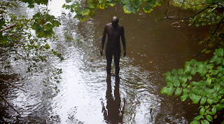
These days my enthusiasm for Gormley's Six Times is waning slightly. I slightly hate the poorly finished stubs near the nipples and shoulder blades that he couldn't be arsed filing off from the casting process. If that is what they are. No idea why he left them. Lazy I expect! I think the ones at Crosby Beach (Another Place) work better than the ones in the Water of Leith, but they are so medium resonance and middle-of-the-road (river?) that I can't work up enthusiasm to either love or hate them. I prefer them to piles of balanced stones, but not by a large margin. There we go, damned with faint praise.

I presume this is an attempt at humorous art.
And like most jokes, works best the first time and then isn't as funny on repeat visits.
We didn't realise just how poor most of the art we had witnessed was until we went next door into the (very much better) Dean Cemetery. We had tried to get in before (being cemetery enthusiasts ever since lockdown,) but found it locked. On this occasion there was a new sign up at the front declaring opening hours and what was not allowed (dogs and cycling - good call and fair enough.) It's almost as if someone realised there was lottery funding available if you didn't keep your cemetery under lock and key.

exquisite stone carving
Right from the get go it was apparent this was quite an upmarket corpsefarm. The quality of headstones spoke of well-heeled departed and worthy locals. Probably not as much wildlife as Warriston or Newington, but worth a visit for the ornamental stone carvings and elaborate masonry.

nice tree!

Quite near the entrance, this headstone for John Bellany made me laugh out loud. I am no fan of his paintings - I don't care for his childish reds and yellows. And yet he is highly regarded, which I find hard to believe. I really don't like his primary coloured daubings and spikey figures. And he seemed dogged by religion and booze. It's not that I don't have sympathy for howling drunks, it's just I have more sympathy for their relatives. Maybe people felt sorry for his self-inflicted continually failing health? (Liver transplant and heart attacks.) I mean alcoholism is a disease none of us would choose to suffer from. Yet strangely a disease only ever caught by those with a huge thirst for boozing. Rarely caught by non drinkers. That sort of a disease. Anyway, Bellany the boozer is marked out with a stone as devoid of subtlety as his paintings. A singular ugly tongue of blue grey marble with gold leafed signature. It leans at a giddy angle to the left (perhaps crouching squintly from a missing liver) as if about to drunkenly stagger.


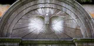
This 3 cornered bestiary was among the more ambitious of the monuments. Two of the birds' thin stone legs were cracked and a portion missing from a third. Can you imagine the nerves of the mason carving six thin sticks of bird leg (and unsupported heads with long pointy beaks!) hoping there were no fault lines or hidden flaws in the stone at those parts that would weaken the tremulously thin stone. And then transporting the thing over cobbled roads into it's final resting place without hearing a snap and clatter?

I probably wouldn't want (for instance) a fountain like this for the back garden of my lottery winning mansion. But I do marvel at the skills of the stonemasons who created it, a good deal more than, for instance, the skills of a Bellany type painter. Or a modern sculptor who doesn't even do their own casting and finishing. It is not a surprise there is very little of this type of work goes on these days. And the stuff that does go on - meaningless piles of junk stacked on gallery floors with no aesthetic value - has no resonance or communication with a bored or absent audience.


looks like my pal George F
There were many low and high relief carved or cast portraits among the headstones. That sort of thing looks not-that-hard once someone with great skill has had a bash. I mean how hard can it be? Well now, just this morning, Janet, a pal on facebook posted an amateur effort that is both not bad for a first go but notably not up to the minimum standard required for a Victorian or Edwardian gravestone.

photo on left: thanks to Janet Fellows
photo on left: thanks to Janet Fellows
So this is a graffiti self portrait by Lawrence of Arabia near Wadi Rum while he helped the Arabs revolt against the Ottomans. I have put a photo of himself on the right to compare. Although the carving looks laughable to start with, the closer you look, the more you realise he has captured those lips and perhaps the nose too, and if the jawline were narrower and the forehead higher it would be pretty lifelike. It is often seeing bad art that makes one appreciate good art. So perhaps I shouldn't be so quick to slag off the likes of Bellany. I mean he makes the rest of us look pretty talented.


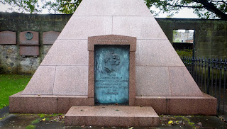
Then there was this monstrosity. Again laugh-out-loud foolishness. I can imagine someone getting caught up in the pseudo-mystical aspects of a pyramid without for a second considering how egotistical it would look at the end of a row of standard plots. Like a Barrett-Home new-build mansion on the end of a row of rural cottages. Furthermore they seem to have gone for a Roman and Egyptian mash up. Egyptian architecture and Roman portraits and text. I bet their deceased neighbours called them nouveau riche as they revolved.


Unusual to see this low relief landscape of Franklin's lost expedition. It is on a memorial to one of the 129 unfortunates who perished. The 2 ships HMS Erebus and HMS Terror (no kidding) left England in 1845 and got stuck in the ice for more than a year while trying to navigate the North West passage in the Canadian Arctic. Much grimness ensued including hypothermia, starvation, lead poisoning, scurvy, exposure, inadequate clothing and probably even some cannibalism before they all died! And we complain about delays at the airport.
looks like a stonker of a hangover
this reminded me of those imprints you get
when a pigeon flies into a french window
when a pigeon flies into a french window

I like this one - you can nearly read the initials B F - boyfriend?

bad hair day?


hiya!

Mary said "George, of George and Mildred"

a little too meme-y

had another close look at this one on the way out
a really nice rendering of an old radio set
a really nice rendering of an old radio set

worth a look, much more entertaining than the modern art gallery
(although the gallery has a better cafe)
(although the gallery has a better cafe)
No comments:
Post a Comment